
This is the before image of my tsunami demonstration game. The object of the game is to save and
protect as many people and buildings in the community from the tsunami. You
must also build accommodations for 320 people, build a hospital and hotels.My strategy for this even was to strengthen
the existing buildings that were there and create the new shelter on the
highest part of the map. I also created a lot of sand dunes, mangroves, and
breakwaters to stop the initial wave and minimize the disaster.
Tsunami After

The only thing that I over looked was not
upgrading the houses enough. After the disaster a total of eight houses were
destroyed, 22 injured and 22 dead. We were then instructed to kill as many people and create as much damage as possible.
We were then instructed to pick two other disasters and record the information of our results. The next scenario I created was an earthquake. I plan on moving to Colorado after college
and I know there are a lot of earthquakes on the west coast so I thought what
the this would be an interesting experience.
Earthquake Before

My strategy was to fix up the old houses so
they would withstand the earthquake. I also had to build more houses to protect
the tourists so I made sure to space out the buildings. I also installed an
early detection system to alert people to evacuate.
Earthquake After

As you can see I didn't do so well with my disaster mitigation.
The next disaster I chose was flooding. Seeing that we live in Eau Claire we have
had our fair share of rising water level and other water related disasters. So
I thought it would be interesting to see how a flood would be simulated in this
game.

To minimize deaths I decided to upgrade all
the preexisting houses that were large and could house people. I then
demolished the houses that were in high risk areas and rebuilt better homes on
the highest part of the map. I also upgraded the town with an early detection
system and put in marsh lands to help soak up the rain. I also installed run
off ditches to direct the extra water in the low parts.
Flood After

I didnt do too bad in this simulation of a flood.
Lab 2: Basic ARC GIS Practice
Lab 2: Basic ARC GIS Practice
During this lab we started using ARCGIS and getting ourselves familiar with the program. We were instructed to create a map of our choosing with data of any hazard that we wanted. I picked the layer Palmer Drought Severity Index.

When looking at this information we are taking the technical paradigm.This could help
governments and society by helping them prepare for evacuations to minimize
casualties. This could also help people learn common trends in hazards to help
better understand them and help prevent from spreading and minimize deaths.There are a lot of
different possible hazards that government and society have to face, by having
so many different data sets it be used as an early warning sign and help save
lives.This could help
individuals evacuate the area and escape the hazard. It could also give people
time to react and plan out things ahead for how to rescue and help those being
affected by the hazard.It can show the
path that the hazard took to get a better understanding of the progression. It
could also give governments a better idea how to handle the hazard and how to
better prepare for the next possible hazard.
Lab 3: Earthquakes & Tsunamis

The image above shows earthquakes that have taken place between 1970-1993. As you can see a majority of the earthquakes that have been recorded are along the tectonic plates lines in the Pacific and Atlantic Oceans. These plate boundaries play a huge part in how the Earth has been formed. The majority of these earthquakes happen at the fault line or near them. The complexity theory is important because it brings all the data together to see the pattern of hazards. This information helps us understand the pattern of the hazards so that we can better prepare for the future and learn from the previous events. This information will also allow for people to be better prepared because they know that there has been these disasters in their area in the past. This map takes on a technical paradigm approach, because were using this model to better understand the occurrence of earthquakes. To make this map better we could have added more information on population and elevation to give us a better idea of how susceptible these areas were to these hazards. Knowing if the areas hit were a HDC or LDC would give us a good
idea on the damage caused by these disasters.
Lab 4: Drought

This image above shows the drought areas effected by water shortage in the United States. As you can see the Midwest, South and East coast are being most effected right now by this natural hazard. The legend on the left hand side gives the view a better idea what the colors represent and how to interpret the map. During the summer this drought has effected farmers by destroying fields and crops, and also it is raising prices in the food market because it is becoming more expensive to produce products as well as there is a shortage being supplied.

 This Image displays the soil content of the united States and its difference from area to area. When looking at the map there are a many different types of soil but the dominant order are Alfisols, Andisols, Aridisols, and Entisols. Where these soils are found are higher crop yields. In the areas of drought there is poorer soil conditions which makes sense because the soil is not as rich and is unable to grow its crops.
Lab 5: Earthquakes

This image would help you asses
your risk of being affected by an earthquake if you decided to live in an area
matching this exact criteria. It would also give you a better insight of what
has happened in the past and that it is highly probable that it will happen
again in the same area.
Lab 6: Volcanoes

This map shows the top five countries that have the most eruptions.

This is a flat rendering of Mount Renier before we got to make it into a 3D model.

This TIN rendering of Mount Renier. TIN stands for Triangular Irregular Network. It shows the elevation of the surrounding area in a 3D view.

The brown on this map represents the lahar that affected this mountain side.


These two images show the before and after of the Mt. St. Hellen volcano. You can see on the right side that the majority of the loss was on the north side of the mountain.

The White areas shows were all the areas that experiences land addition.
The explosion of the disaster dispersed the contents everywhere, and this is
the result of the material being relocated.

The black area on this map shows where materail was lost after the erruption.
Lab 7: Mass Wastage

This map shows the elevation of forest falls, California. All the areas that are covered in black indicate the area above a 30 degree slope. These areas are prone to slope failure when saturated. Mass wasting in this area
is caused by ground composition and amount of rain fall. By mixing loose soil
and high rain levels makes this are more susceptible to mass wasting.
This image above shows 24 shapefiles of Doppler radar data, each representing a snapshot
in time of rainfall measurements taken at five-minute intervals during an intense
storm that took place in Forest Falls, California, on July 11, 1999. The lightest precipitation is represented by green and the heaviest
is shown in red. White dots represent no precipitation. After gaining this information we watched as the precipitation shifted over time and watched what area was effected the most. After watching the pattern change we got a better understanding of the hillside and what areas are more
likely to be effected by mass wastage. Soil depth would give you an idea of
what the ground composition is made of and how it is able to stay in place.
Knowing how much plants and vegetation are in the area would help. After reviewing the map the
safest part on the maps would be at the peaks of these mountains. There are not
a lot of area that is safe.
Lab 8: Flooding

This map above shows what we did in our Lab 8 Exercise. Our task was to create the effects of a 100 year flood that could occur here in Eau Claire. The green area shows how far the water would spread past the regular waters edge. The red lines show what FEMA's flood map shows for a 100 year flood. The reason that they both don't match up is because when these were created the resolution of the maps were different. The green is more percisse because it was done with a map with a better resolution. The black box represents the lower campus of the university and what buildings would be affected by this flood.

This map shows what it would look like if the flood rose to 790 feet.

This image shows the flood at 800 ft.
Lab 9: Costal Flooding
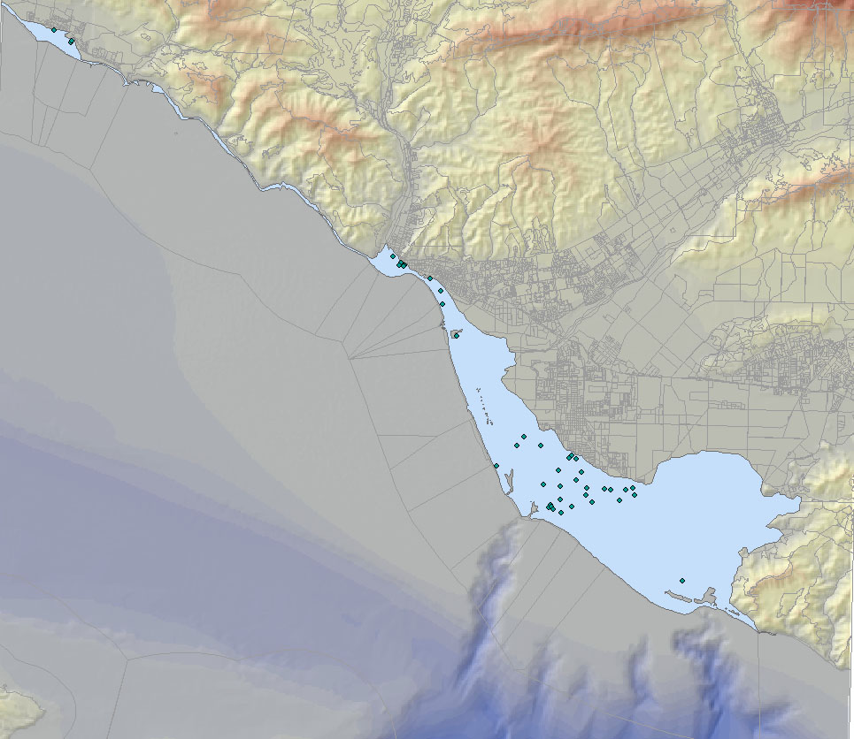
This map shows the effected area due to coastal flooding caused by a tsunami. The light blue area displays the are that was flooded by the natural disaster. The green dots represent the schools, hospitals, and emergency building that were effect by the disaster. In total there were 52 facilities damaged by this storm.
No comments:
Post a Comment